Unit 1 of my photography course with the British Academy of Photography was focussing on still life photography. This blog post will briefly discuss the two assignments and demonstrate some of the camera settings I have learned. I will also be sharing some of my 'final images' for the assignments.
It was really interesting researching the origins of still life. The concept started as paintings in the renaissance period, but as photography developed, it was commonly used for photographs too. Particularly in the early days of photography, still life worked well as the limitations of the early cameras did not affect the photographs. In fact, the long exposure times of early cameras meant that still life was an ideal genre of photography as the subjects were inanimate and therefore the exposure was not negatively affected.
There are two subcategories of still life: found still life, and created still life. Found still life refers to an arrangement of objects which have not been manipulated into a position prior to being painted or photographed. Photographs are generally taken of these items in their ‘natural’ setting or where they have been found. Created still life, on the other hand, refers to the artwork of objects which have been carefully arranged by the photographer.
Use inanimate objects as subjects
Composition is key (i.e. use the rule of thirds, L-Shape structure, converging or leading lines, depth of field, Fibonacci spiral, etc.)
Traditional still life most commonly uses food/flowers/dead animals (subjects that were previously living)
Vanitas themes (i.e. human immortality, time running out, material things won't save us)
Having completed this unit of the course, I have learned that still life photography is something I really enjoy. I like that the photographer is entirely in control of the arrangement and that once it's been set, there will be little to no movement. The genre of photography is predictable and offers huge scope for creative and stylistic choices. It is definitely a style of photography that I can see myself doing more of and I look forward to doing so.
We were asked to complete some research into the background of still life, still life photographers, traditional still life compositions, and photographic techniques. Once we completed this research, we were asked to try different camera settings to explore the effect they had on exposure. For example, we had to over-expose and underexpose a scene by adjusting the shutter speed, ISO, and aperture. This was really useful to be able to compare an underexposed, over-exposed, and correctly exposed image of the same scene, as it clearly demonstrated the effects it had.
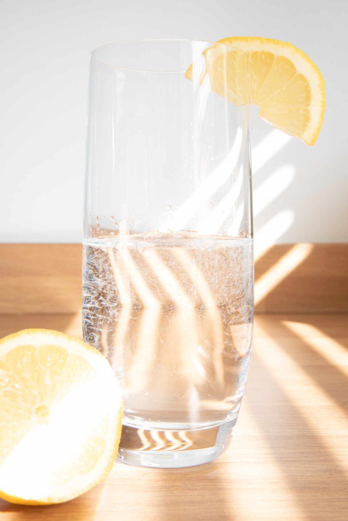
For the below images, I was experimenting with the effects of shutter speed on the exposure of the image. I chose lemonade as the subject for this particular section of the task as I knew that this would not only help to improve my understanding of the effects on exposure but also on motion blur/freezing motion as the bubbles in the lemonade moved while taking the photographs.
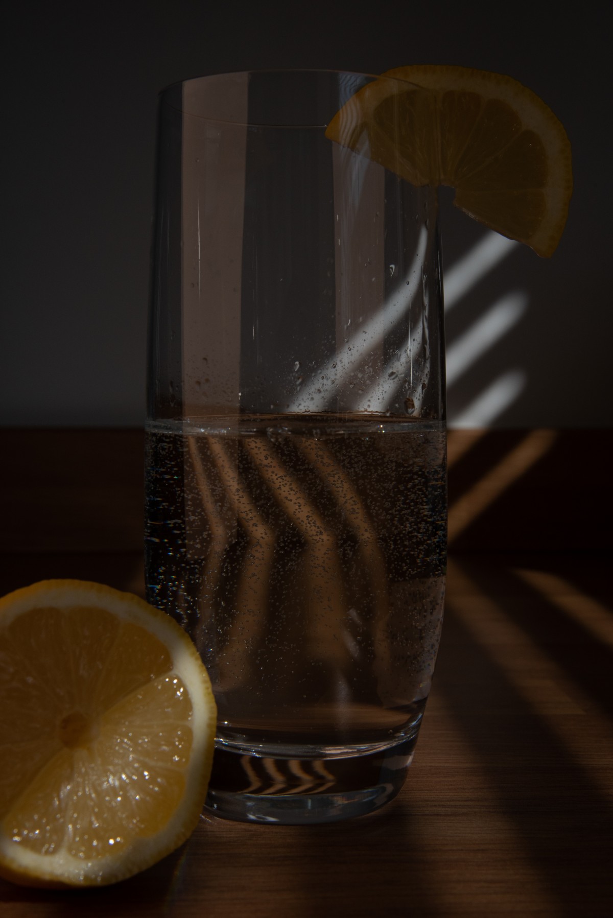
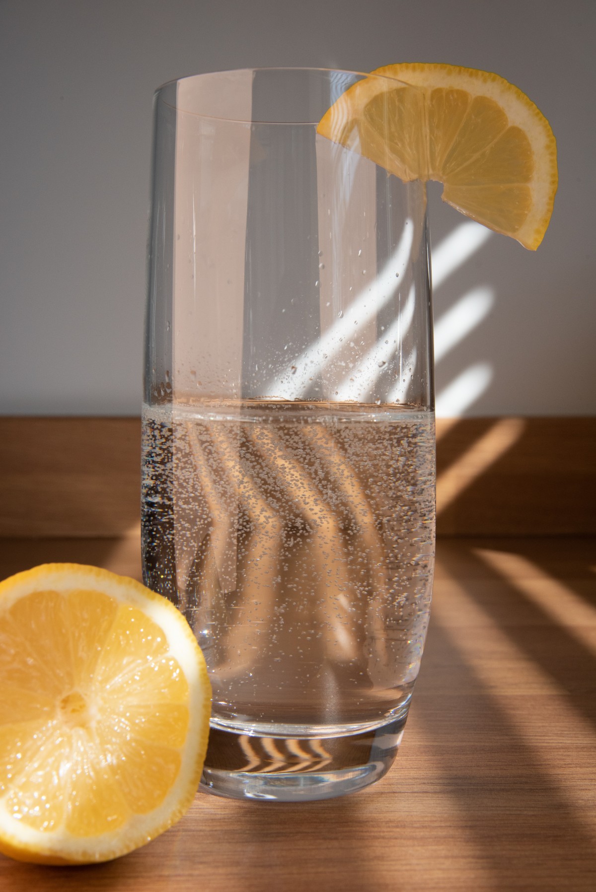
Once we tried some different camera settings and learned how to use the light meter to balance out an image's exposure, we were asked to use this understanding, along with our new-found knowledge of still life photography, to create a final image. After some deliberation, and a lot of trialling different arrangements, I chose to photograph some salt and pepper mills, with some spoons filled with different herbs and spices.
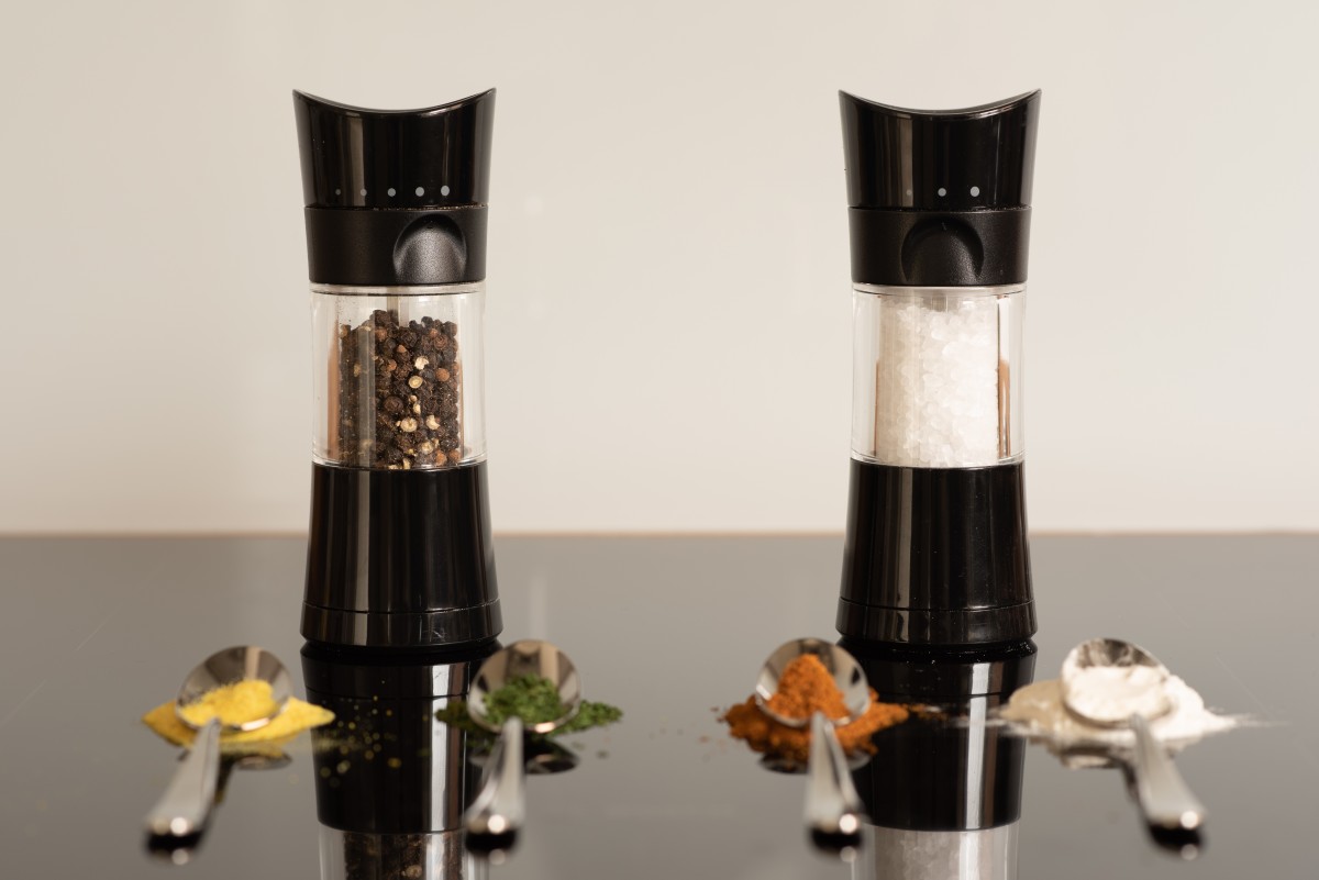
I was really proud of this composition and as it demonstrated all that I had learned throughout the process, and was by far the most creative and successful composition of all of the ones I had created throughout the assignment. I really took the time to consider my arrangement, the deeper meaning, the angles, perspective and compositional techniques. I chose to incorporate a deeper meaning in my image, by using seasons in the meteorological sense, as well as the herbs and spices sense.
The salt and pepper grinders could also represent a change between the seasons, which adds an additional layer of intention and meaning to the image. Furthermore, the salt being white and the pepper being darker colours brings in some contrast, similar to that of day and night. When carefully analysed, there is a theme of time running through this image, in the change of the day to night and also changing through the seasons. This fits well with the traditional vanitas themes of time, which I learned about during my research, and with the overall theme of my image being food, I feel I have been able to maintain a number of traditional still life concepts in my final photograph.
In terms of the arrangement and composition, I like how the salt and pepper mills sit nicely between the spoons, almost like two distinct sets of train tracks. The leading lines work really well in directing the viewer’s eye to the salt and pepper mills, which were intentionally put in focus. The salt and pepper mills do line up with the rule of thirds, although the line in the imaginary grid doesn’t cut directly through the centre. Had I positioned the two mills directly next to each other, it would have created a lot of negative space, and a less interesting composition.
Throughout the build-up to my final image, I enjoyed experimenting with reflections in the hob, so I chose to use this in my final image and I am pleased with the way it turned out. Initially, the salt and pepper mills were closer to the tops of the spoons, but I moved them back to open up the image and give more perspective and depth. In doing this, I was able to give a clearer reflection, which I am really pleased with. When the mills were positioned closer to the tops of the spoons, it wasn’t as clear that the reflections were in fact reflections of the mills, so this slight adjustment to the arrangement really offered some clarity to the reflections.
Assignment 2 was in a very similar format to assignment 1, in that there was a research element, a camera techniques element, and then a final piece. The assignment was still on still life; however, the focus was on hygge-inspired still life, and, in the brief, we were asked to produce a final page including 4 images, which were intended for a contemporary living magazine.
First, I had to get to grips with what Hygge is. I'm still not sure that I could properly explain it to someone now. But the general gist is that it is a Danish concept, which encourages being present, or in the moment, by creating a cosy, relaxing environment, and doing things you love. That could be on your own, or in the company of others. And it could be as simple as drinking a hot chocolate by the fire, or being a little more active and baking some cinnamon swirls.
In the camera techniques and settings element of the assignment, I learned about metering, white balance presets, and exposure compensation. This was, again, really useful, as I knew nothing about metering or exposure compensation, and although I knew what white balance was, I didn't know how to use the presets, or what effects each of them had on an image.
We were asked to use the different metering settings (matrix or evaluative, spot and center-weighted, etc.) to develop an understanding of the effect it can have on the exposure of an image. Below, are some of the examples I submitted for my assignment.

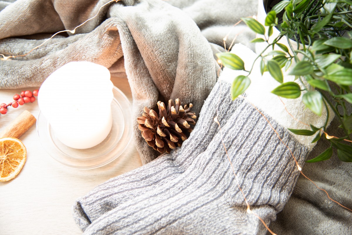
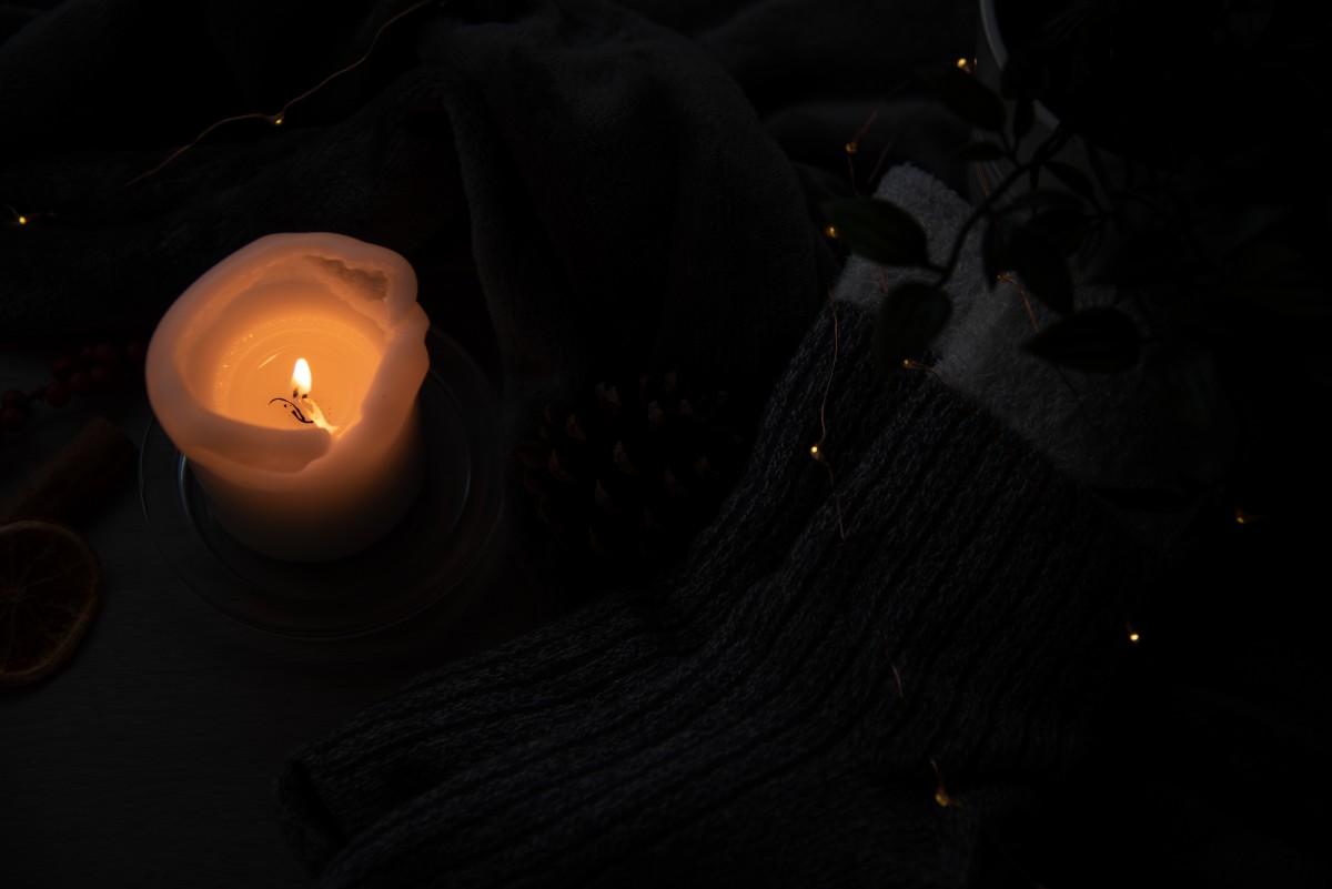
Here are some images demonstrating the effects of the white balance presets on the camera. It is clear in the images how the colour tones in the image change and this is due to the way the camera is trying to compensate for external factors which may be impacting the colour tones. For example, the shade preset assumes that the environment is a little darker and makes the image feel cold, so it brings in some warmer colour tones to balance this out.

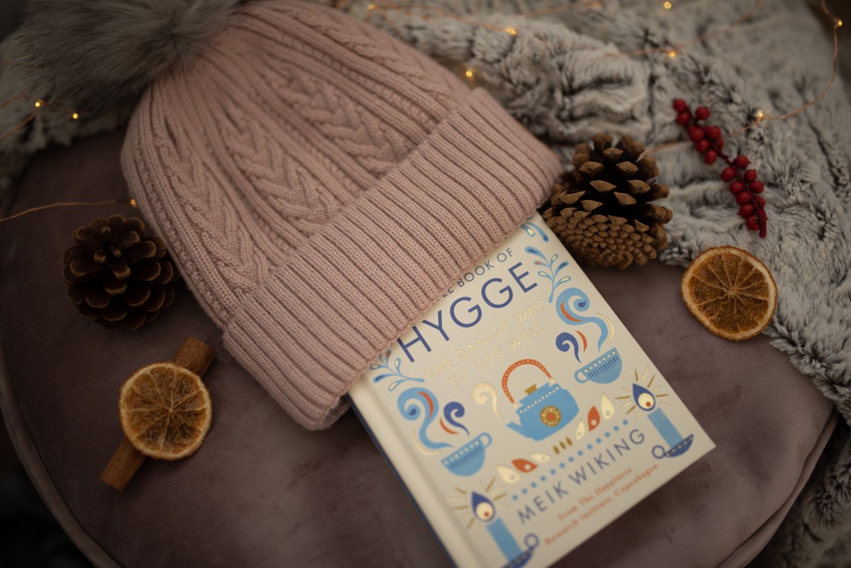
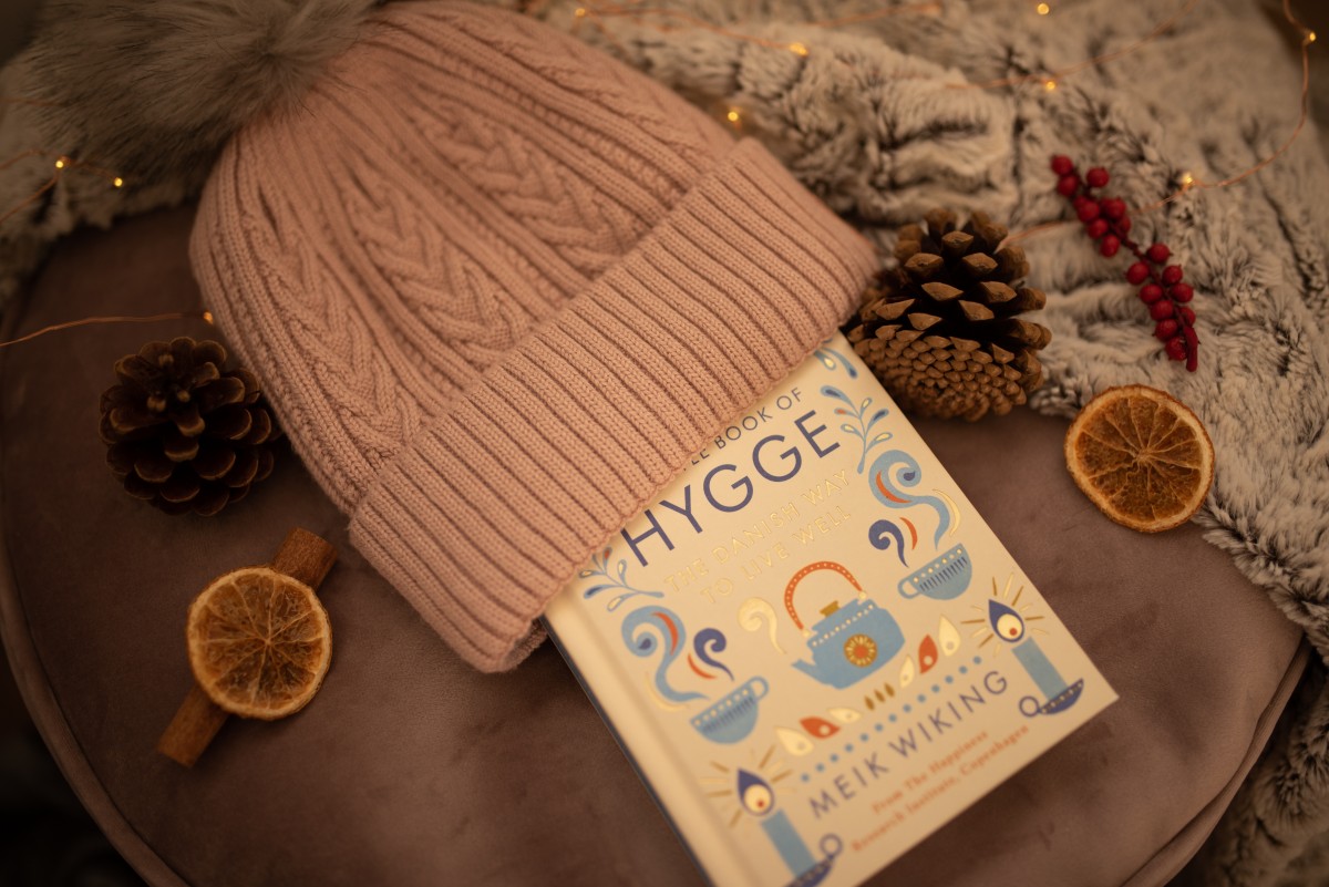
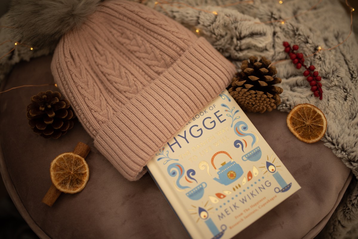
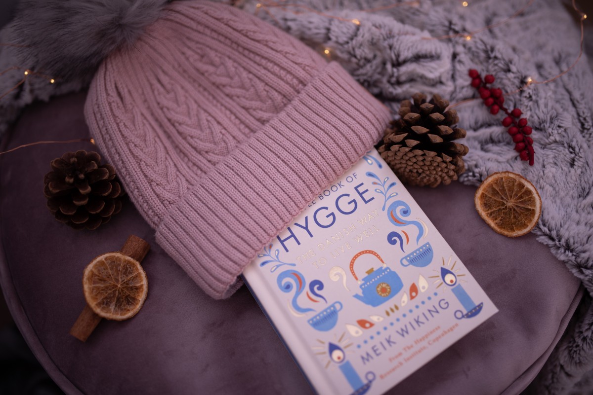
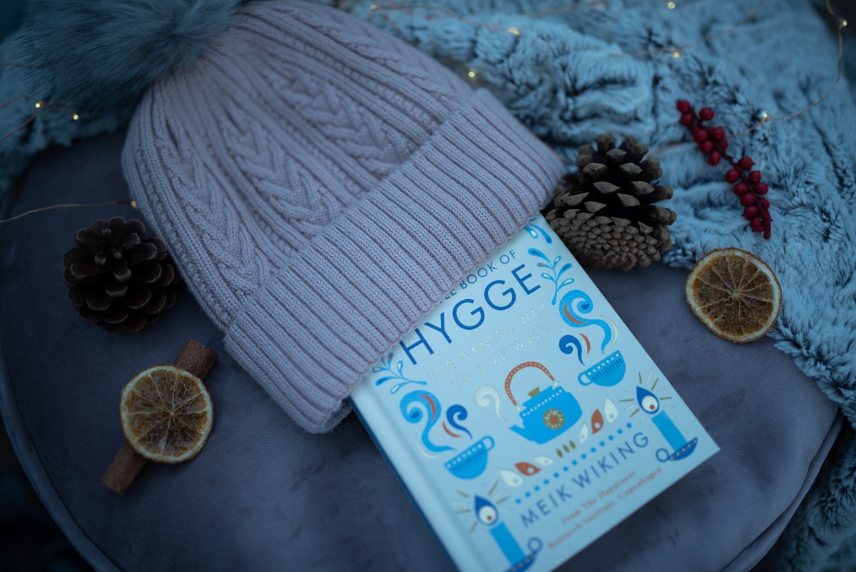
Once I completed this section of the assignment (Task 1), I was able to move on to task 2, which was to take a number of high quality, hygge-inspired still life photographs, and then choose 4 and present them in a format that could be used for a contemporary living magazine. In the brief, it was also made clear that the photographs not only needed to reflect hygge generally but also what it specifically meant to me personally.
This was challenging as I am a perfectionist and wanted my images to be perfect. But, I also wanted to ensure that I tried some new things, which meant being out of my comfort zone and also not getting things exactly right. It took a long time for me to get the arrangements and compositions correct for the majority of some of them, and, to be honest, I'm still not happy with all of the images that I took in the final task. Below are the images that I didn't choose to use in my magazine double-page spread.
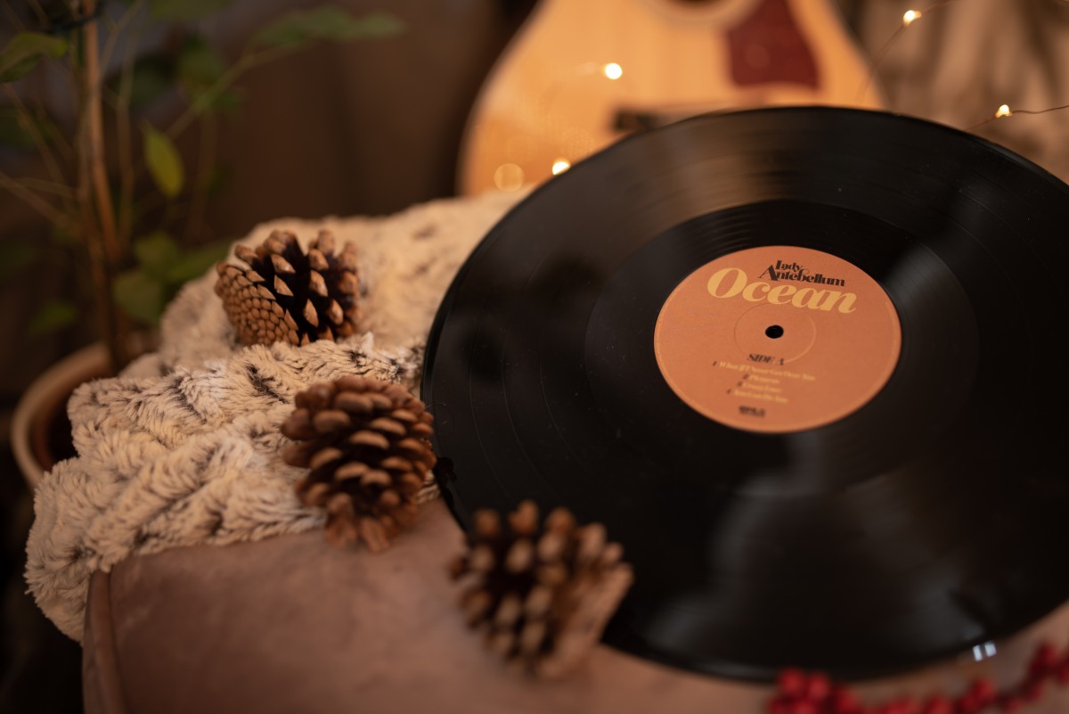
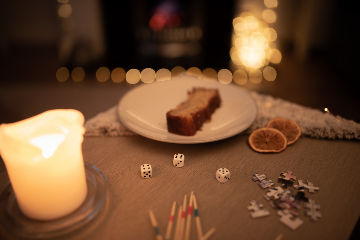
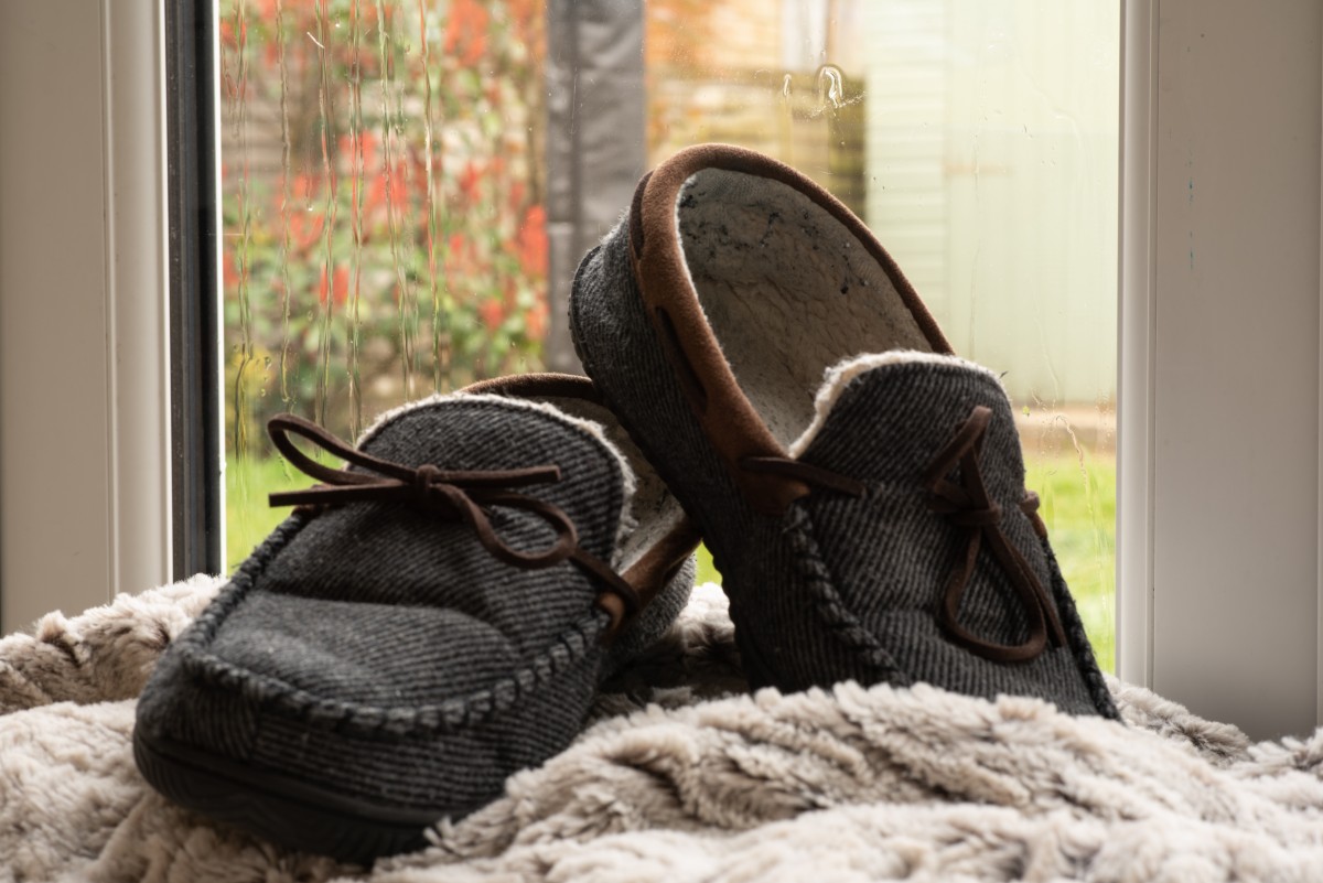
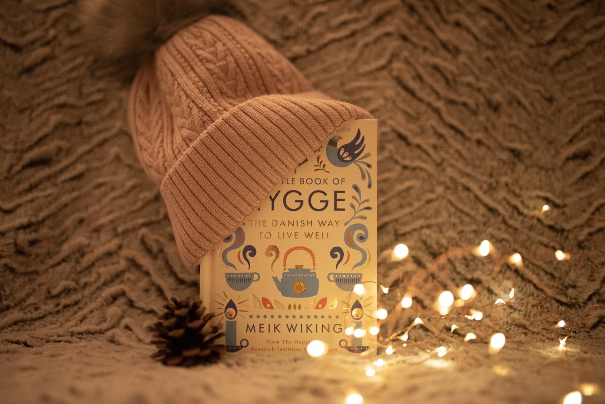
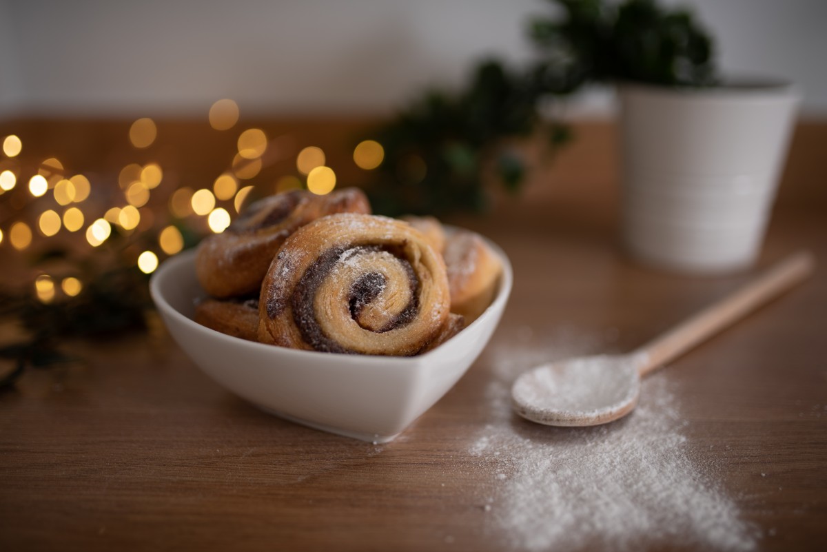
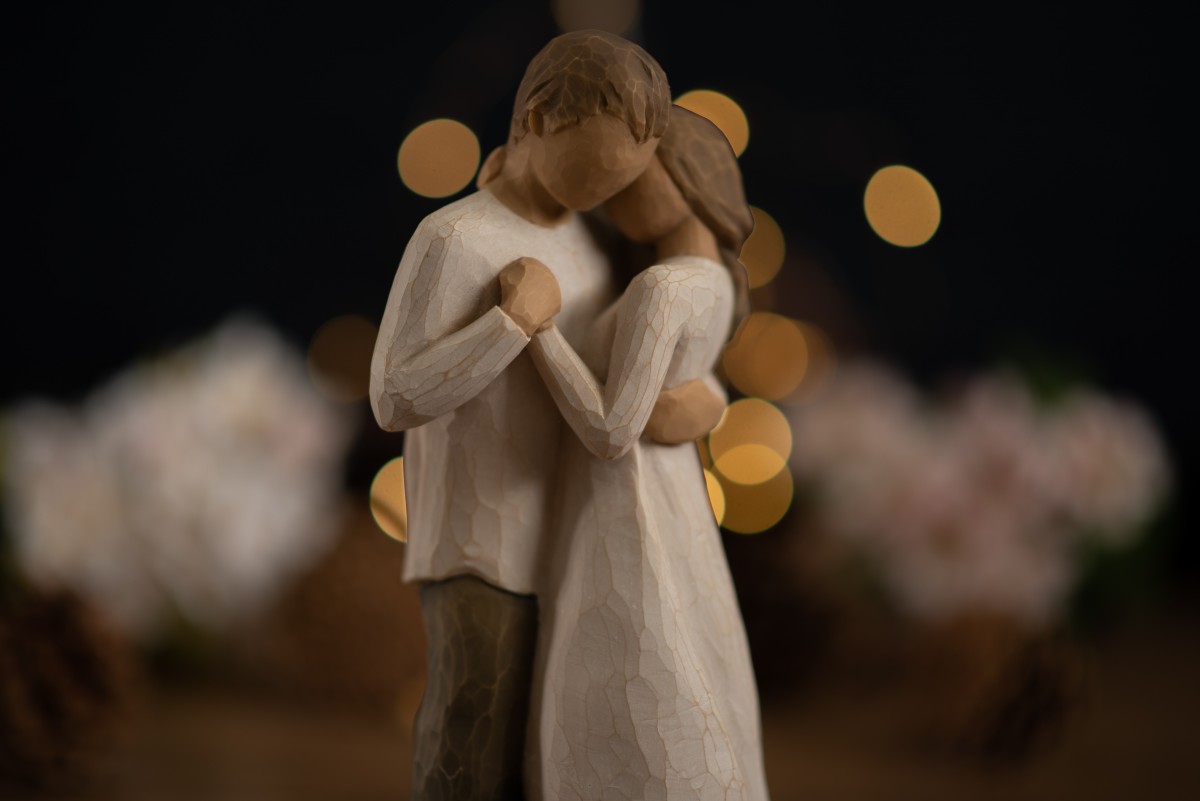
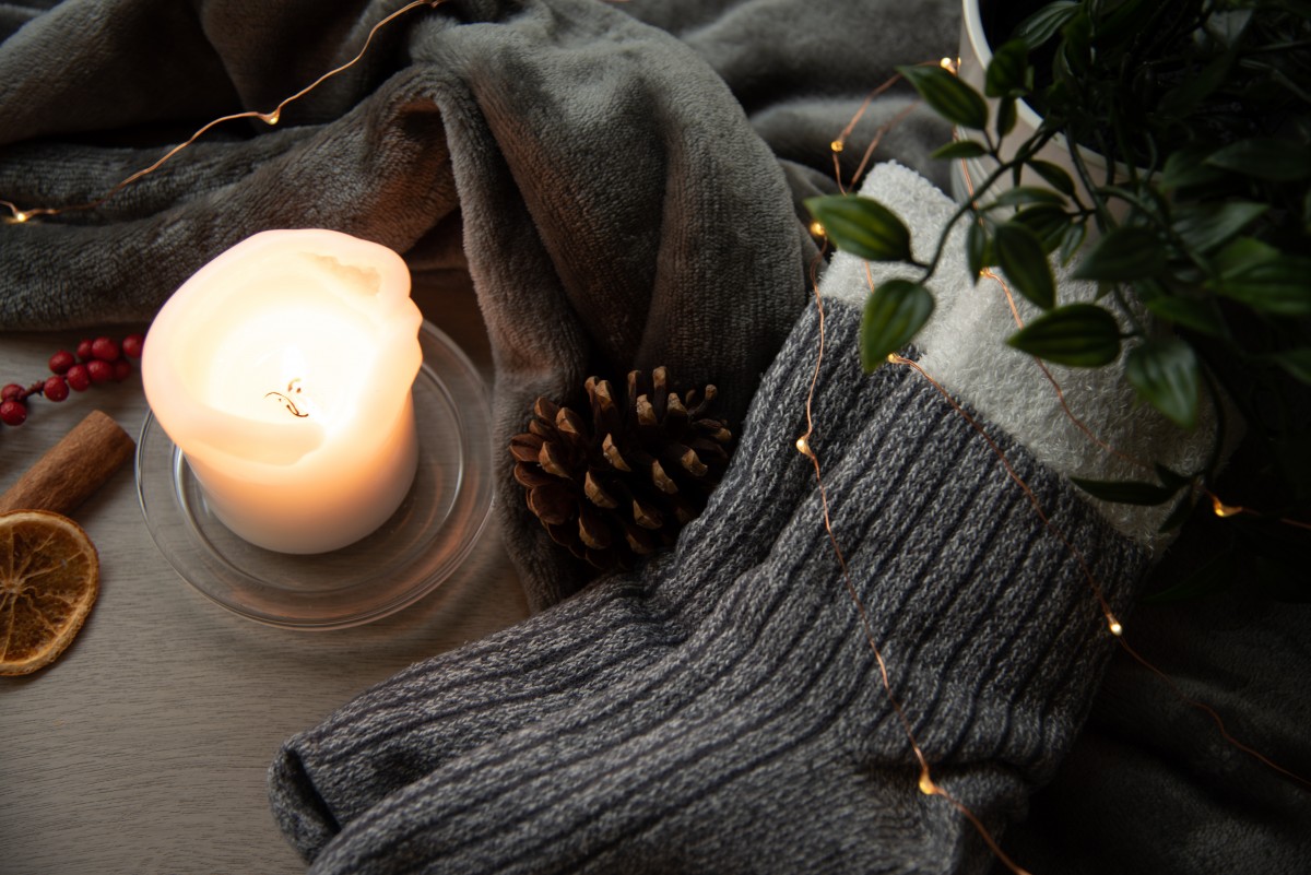
However, I am really pleased with the images and the presentation of my final 'piece' as it were. I feel as though it reflects hygge nicely and also gives a sense of what hygge means to me. I particularly like how the colour tones feel consistent, and that there is the use of fairy lights in each image which again offers some uniformity. In all of these images, I used a shallow depth of field, which, when researching, I learned is a common technique in hygge photography as it can create a softness to the image and give a nice cosy feel.
Below are the final images that I used in my presentation.
